Annie
Reynolds
Painting
I
Molly
Zimmer
October
23, 2017
Francis
Lisa Ruyter
Francis
Lisa Ruyter is an American born artist raised in Maryland. Ruyter is known to use paint
and permanent marker to recreate images from photographs that he takes. By working from his photographs, the artist is successful in capturing the intimate angles for which many of his works are known. Ruyter's process involves transferring his photographs onto surfaces and resolving them into line drawings, resulting in semi-abstracted, two dimensional renderings of the subjects, \\the final product being a balanced mix of synthetic and realistic imagery. I find some of his pieces to be a little hectic due to the intense neon colors and often busy composition. My favorite works that I have seen of his are the ones in which he uses slightly more muted colors and are less packed with straight lines and geometric shapes, a good example of this is the painting titled Marjory Collins: Washington DC. Dancing class at an elementary school.
Recent exhibitions include: the
Macedonian Museum for Contemporary Art, Athens; Museum der Moderne Salzburg;
Kunsthalle Krems; Kunstbuero, Vienna; Kunsthaus Graz; Kunstmuseum Wolfsburg and
the Museum of Modern Art, Ibaraki Japan.

120 × 100 cm
Russell Lee: Daughter of agricultural day laborer in bedroom of home in McIntosh County, Oklahoma, 2012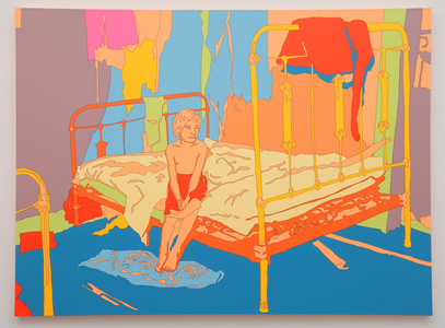
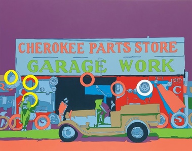


Francis' technique "bugs-out" his layering nicely. His lack of tonal variation and pure colors illustrates how shading is only sufficient in order to show distance but layering is necessary.
ReplyDeleteSomething about the lack of value in Francis' pieces bothers me, but I am not exactly sure what or why. The intensity of so many neon colors clustered together makes my eyes hurt a bit, but I also enjoy the concentration of color.
ReplyDeleteI think the lack of value does draw out the color, but also flattens the space within the works. The flattening also adds to the pop art feel where paint is evenly and flatly layed onto the surface. I life the organic ones of natural spaces because of the contrast between flatness and irregular shapes.
DeleteThe piece of the dancing class is very different from the rest and the only one I am drawn to. It uses shadow to make the figures seem 3d without the shadows the forms would be flat. I also like the blue and yellow combination of the piece. The yellow seems to have a feel of real light which I enjoy.
ReplyDeleteI appreciate artists who are brave enough to defy expectations for color, both from their viewers but also in themselves.
ReplyDeleteAll of these works remind me a bit of Andy Warhol, the last one "screen print with color" has a negative photo feel, the use of color makes the works unique.
ReplyDeleteThe colors remind me an inverse or a photo negative. This is jarring to the mind. However sometimes I see colors like this, they remind of the kinds of paintings that would be seen in a coffee shop.
ReplyDelete