Monday, November 20, 2017

Artist Statement

Frida Kahlo Assignment Artist Statement

I created an oil on canvas piece titled How It Used to Be. Although the piece was based on viewing Frida Kahlo’s show it does not mimic her style in any way. I do not particularly like Frida Kahlo’s art. I do however, like her story. The first thing that comes to my mind when I think of Kahlo is her obsession with Diego Rivera and the pain the two of them went through together. He was, in a way, her weakness. My weakness is a boy I left back in Kansas when I came to school here in New Mexico. It was and continues to be incredibly hard. I created the image by putting down the yellow/white background first and then laying in the figures. I used quite a few warm colors in the piece to fit the theme of the happiness that once was. I used the assignment as a practice for a painting I’ll do at a later time. I think there are several weaknesses to this piece and overall i don’t like the finished product. Maybe it is because i’ve looked at this image for so long I can’t stand it. Or maybe it’s the flaws in the craftsmanship of the piece that bother me. Either way I am not pleased.

Artist Statment - Morgan Y.

Morgan Yabeny
Painting I
Artist Statement

            My oil on canvas painting is called Intervals. The name depicts most the paintings tones, process, and meaning. The picture shows a figure in a certain setting along with other few objects. The figure is a representation of myself along with the theater happy and sad faces. This is also accompanied by a spacious apartment room along with a rose and Plato's head statue. These represents different aspects that affects my life's perspective and towards the physical body. The amount of space between the figures gives the picture movement along with my self-motivations. The colors chosen help convey sophistication, tenderness, and loneliness. I used a lot of neutral tones of blue and yellow along with neutral values so some objects could be interpretive. The image references towards Frida Khalo's many self-portraitist because of her poses. A lot of emotion are conveyed just through her single pose. Her poses are powerful and meaningful. I try to incorporate that meaning along with this attempted piece. 

Artist Statement


                                                            Shannon Smith

                                                            Painting 1

Artist statement

            My oil on canvas piece is entitled Breathe. I was very inspired by how graphically Frida Kahlo depicts things like hearts and her spine in The Broken Column (1994). Her attention to detail is what inspired me to paint the lungs and ribs the way that I did. My piece features a figure that is meant to represent myself, with the lungs and ribs showing in the chest area, a cherry blossom tree, a breathing tube wrapped around the tree, three flowers and mountains. I used a wide range of colors to represent a wide range of emotions as the viewer looks at the painting. I used variants of red and pink for love, family and femininity; I used black and white for fear and hope respectively; yellow was for happiness and green was for money.  I decided to use all these colors because of the experience that inspired the painting itself, over the last winter break, my grandma was hospitalized for around two months due to a collapsed lung. It was a very scary and stressful time and has left a lasting impact on my family as she now must have an oxygen pump constantly among other things. I wanted to use this painting to show how I have personally responded to the event emotionally. The piece is meant to show that my fear is mostly in the background now and I am trying to embrace the fleetingness of life now.  

Artist Statement

Maddie Fenton
Painting 1
Artist Statement


            My piece is an oil on canvas entitled, Peaches. After looking through the Frida Kahlo exhibit I wasn’t particularly inspired in terms of the style in which I wanted to go about my own self-portrait, so I then turned to Kahlo’s paintings. After researching her work a little further I found one of her paintings, Self-Portrait with Bonito (1941), to possess the same qualities of what I was looking to do in my piece. In Kahlo’s work, she has warm yellows in the background behind her head and her skin has the same yellow undertones mixed with reds in her cheeks, creating a cheerful and serene atmosphere. Her facial expression doesn’t seem to show much emotion, but the overall piece’s emotion is still very composed. On the right side of Kahlo, she has her bird, Bonito, resting on her shoulder, which is reflected in my piece as I hold my cat, Peaches. Like Kahlo’s, portrait, I chose to use warm and bright tones to express emotion. I wanted to create a happy expressive piece that mirrors my relationship with my cat. I first used an underpainting of pink and red to establish a comforting and nostalgic feeling with the piece, mostly because pink is a color that I associate with being home and it is my favorite color. I chose to include my cat in this piece because she has lived with me for over a year now and due to a lot of major changes recently in my life, I would consider her a constant and with my self-portrait I wanted to create a bold and uplifting piece that resonates with others but mainly myself.

Sunday, November 19, 2017

Lea Angel Cross
11/19/2017
Painting 1

                                                                 
                                                                    Artist Statment
The piece that I painted on canvas with oil paints is titled Harmony between Faces and Spirits. I was inspired by Freida Khalo’s work particularly the painting “The Two Frieda's” I liked the painting because she painted a human heart over her breast, that symbolically reflected her inner emotions towards herself. Originally I had different plans for my painting, I struggled to chose a topic. I wanted it to be personal in topic and style. I thought about some of my hardship’s and myself but I struggled to come up with idea’s. The other option that I thought about was painting someone close to me. However after a I received my canvas I took a weekend to think about my topic. I realized that I wanted something the incorporated my past and present, and with my anniversary just passing. I decided that I wanted the piece to be more intimate and include more than just myself. Digging up old photos from just a few years back I found the first photo I had taken of me and my husband when where where still in high school. With my reference in hand, I began working on my canvas. I liked the raw emotional energy of the human heart so I decided that it should be the center piece, however my main subject’s was faces of myself and my spouse so I put them off center, doing my best to balance them out. I chose to color them as close to our actual skin tones as possible. My theme was a balancing of energies. After I painted the faces, I painted a yin and yang symbol for the background. The yin and yang symbol was significant to my upbringing as I studied martial arts for a lot of my childhood. The symbol stands for creative and destructive energies which is similar to feminine and masculine energies that I depicted. I felt that it was appropriate as a topic and as a background image. The colors in the corners symbolize spiritual energy, I decided to make them vibrant to bring balance to the heaviness of the faces and the black from the yin and yang symbol. I really enjoyed painting this piece and feel that it embodies my relationship with my spouse.

Thursday, November 16, 2017

Artist Statement - Inner Pain's Outer Portrayal

Abigayle Goldstein
11/16/17
Painting 1
Zimmer

This oil on canvas painting entitled Inner Pain’s Outer Portrayal is inspired by some of Frida Kahlo’s mirror image portraits and split images landscapes. The left side incorporates dull cool colors - white, blue, and sienna tones - in the representation of a hospital room. The dull cool colors are meant to represent a kind of monotone hopelessness that comes with an illness that is not being treated or understood. The right side incorporates vibrant warm colors - pink, green, yellow, etc. - in the representation of a landscape with mountains, valleys, and sky. The vibrant warm colors are meant to represent the possibility of happiness and wellness when a body is whole. A black line down the middle splits the two sides from each other, but two figures of the painter - on on each side of the canvas - reach out to each other and catch hands in the middle of the canvas. Both figures are nude, but the figure on the left is crying and has multiple bright red lines striking out parts of her body where pain is experienced but not seen. The figure on the right is whole. The process of the painting was an underpainting that established the dark divide between the two sides of the canvas, a second color underpainting that established the colors necessary to convey emotion, and a final colored painting that established all the necessary details of the landscape, hospital room, and nude figures.
This painting was specifically inspired by Frida Kahlo’s desire to show her inner pain and injury on the outside of her body in an attempt to show others what she was feeling but that was invisible. This resonated with me because I am currently in the process of trying to get a diagnosis for an invisible disease that I have been living with for two years now. Because my illness can’t be seen, it’s hard for people, including doctors, to understand or care about how I am feeling. I have been exploring multiple methods of portrayal to open eyes to the kind of pain and illness I experience on the inside but that is not on the outside of my body of my attitude. I chose to use the mirror images because I didn’t want the painting to dwell on the hopelessness of illness, but to offer a vision of opportunity and hope for the future, which is why the two figures hold hands to create a link across the divide. For me, this is a direct representation of the story of the kinds of emotions and struggles I’m currently experiencing, how I hope I will someday feel about my body and health, and how I profoundly related to Frida Kahlo.
Finally, inspired by the class trip to the Frida Kahlo exhibit and the process of painting, I also wrote a poem for an advanced poetry class I’m taking this semester that I will include here:


INNER PAIN’S OUTER PORTRAYAL
For Frida Kahlo and Natalie Scenters-Zapico

Image one: sunflowers, their petals
wilting with every passing day.

Image two: piles of panty liner
wrappers and stained underwear.

Image three: hot and damp and then -

Image four: blotches blooming like
roses across numb white toes.

Image five: matching red marks from
pressure - elbows and thighs.

Image six: a turquoise and white rosary.

Image seven: mirror reflections reveal
no evidence in a bush of unkempt curls.

Image eight: bruised knees on either
side of a swirling drain.

Image nine: water drips in the dark
off of beads and the arms of a plastic cross.

Image ten: fingers - frantic - search skin for answers.

Image eleven: tears and water and water -
indistinguishable in copper pipes.

Image twelve: wet hair drips onto soft clean

clothing hiding nothing at all to hide.

Monday, November 13, 2017

Elizabeth Peyton


Elizabeth Peyton

(Dark) Harry, 2002 
                                                                               

Elizabeth Peyton

Gavin on the Phone, 1998


Elizabeth Peyton

Andy Warhol, 1997


Elizabeth Peyton

Leonardo, February 2013,


Elizabeth Peyton

Jay-z, Glastonbury, 2008


            Elizabeth Peyton was born in 1965.  She was born in Danbury, Connecticut. In 1984 through
1987, Peyton attended the School of Visual Arts in New York. When she was attending there, she
showed a favoritism towards portraitures. She was also known to paint her friends during school. She
would make them as protagonists in books she would create while she was still attending school.
            After graduation, Peyton’s career didn’t take off very fast. Peyton didn’t have her first solo 
exhibition until six years after graduation. She did work a few jobs though. Her second solo
exhibition featured work of famous historical and literary figures. The second exhibition got lots of
criticism though. Her later work featured rock stars, friends, and family. Peyton’s work was hailed for
her use of color and design.
            Peyton is a contemporary American painter widely known for her small-scale portraits of
celebrities, friends, and historical figures. Her work is characterized by thin washes and jewel toned
colors. She has painted include Kurt Cobain, Barack Obama, David Bowie, Kanye West, and the
royal family. She is related to other contemporary artists like Lisa Yuskavage and Robert
Mapplethorpe. I enjoyed learning about Elizabeth Peyton's work because I am really intrigued by
portraits and want to learn more in doing them in the future. 


Work cited

“Elizabeth Peyton.” Edited by Artnet Worldwide Corporation, Elizabeth Peyton | Artnet , Artnet, Jan. 2017,

“Elizabeth Peyton.” Edited by Artsy, 62 Artworks, Bio & Shows on Artsy, Artsy, Jan. 2017, www.artsy.net/artist/elizabeth-peyton.

Wednesday, November 8, 2017

Hieronymus Bosch: Surrealist of the Renaissance


Hieronymus Bosch was a North-Netherlandish painter (ca. 1450-1516). 
Self Portrait

During the Renaissance and Reformation in northern Europe (late 15th century), his work was popular and imitated by many. But as time passed, in the 18th and 19th centuries, Bosch was viewed as absurd and sacrilegious as he was forgotten by the common people. However, Bosch has re-trended into modern aesthetics (Snyder). While sources do not specify, this could have something to do with the rise of Dadaism and the avant-garde movement which popularized satire, surrealism, and nonsense. Bosch’s work would make sense to come back, as you can see.

“Tondal’s Vision” Oil on panel (ca. 1450-1516)
*Fun fact, If you cut this piece into 48 squares, each square would have a stable composition with interesting imagery. I found this out very late at night.

Unfortunately, little is known about Bosch and his personal life. He was a skilled artisan and was given commissions for altarpieces (such as "Christ Carrying the Cross"), which fragments have been found. But his beliefs and motivations remain a mystery.

*Something noticeable about "Christ Carrying the Cross" is the direction each person is looking. The commoners in the upper left are looking away from what's happening.
“Noah’s Ark on Mount Ararat”  Oil on wood 69.5 × 35 cm

“Hell 2”

“Hell” 1505-15 Oil on wood 86.5 × 39.5cm

All we have are symbols from his preserved works to interpret. Looking at his most famous work, the Garden of Earthly Delight, we see phallic towers, giant fruits bursting with seeds, stagnant water as spawning grounds, and multitudes of humans and other animals. This middle section of his triptych shows procreation, nature, and life. Notice in the far right of the midline of the piece, there’s an owl (which was commonly used for a symbol of “bad times coming”). 

"The Garden of Earthly Delights” (ca 1495-1505), Oil on wood, 220 × 389 cm

“Garden of Earthly Delights" – Left Panel


The left panel of Bosch’s garden shows what I can only imagine is God with Adam and Eve. This could entail that you could “read” the triptych from left to right in a linear timeline. From the beginning of life on Earth (Adam and Eve), past a period (Golden Age) of fruitfulness, to a future of chaos(?).


“Garden of Earthly Delights"-Right Panel


The spawning water threads through each panel where it freezes in the right. Some see this as a symbol of death or sterility (Snyder).

The imagery of this panel is a good example of what makes Bosch a creative genius. The intricacy of a Where's Waldo page doesn't dilute the quality of each figure's design. There are creatures, scenarios, with combinations I feel, are on par with Salvador Dali's imaginative level. But more impressively, this was made in the time before the Surrealist movement.


Right panel detail
Looking at the background up close, we can see the amazing level of detail and understanding of light. Fires bring out the silhouettes of buildings and illuminate the smoke filled air, hot ash, and people trying to escape. The very background shows clifts which even, then fade out to show more depth.


Bosch was an innovator. While his life is off record and his artistic aim cryptic, his usage of creatures and dark complexity is an aspect I admire. I hope to better understand his creative process and incorporate it into my own work.


Works Cited

Snyder, James. Bosch in Perspective. Englewood Cliffs, N.J., Prentice-Hall [1973], 1973. Artists In Perspective.

Images source: https://www.hieronymus-bosch.org/

Monday, November 6, 2017

The Life of Ruth Jensen Miller


                                             Ruth Jensen Miller 1899-1979

Portrait by J. Laurie Wallace
Originally from Omaha, Nebraska Ruth was a wonderful artist who was also involved in artist groups and councils. Being very active in the art community was very important to her. She was an actress as well, being the understudy to Mary Pickford and prominent actor in her era. Her paintings are simply gorgeous. Her style was definitely realistic, and as for her process she started multiple things at a time.  Convenient for oils, because they take awhile to dry. 

No Title
1960
18 x 24"
Oils

                                                      
Her way of perfectly portraying what she painted is almost unfathomable. The realism in her work is spectacular and on a whole other level technique.            
No Title
No Date
18 x 25"
Oils


She worked on mostly larger pieces of paper or canvas and most of her work is in oils or watercolors.


No title
No Date
17 x 23"
Watercolor


Here is one of her stunning watercolor pieces that is so beautiful to look at. Her use of color and the mostly complimentary color scheme brings the piece together. 


"The Untamed"
No Date
25 x 30"
Oils


This is her spectacular painting of a wave crashing against seaside rocks that won the Governor's Arts Award for best of the show. 


For someone who was from Omaha, she painted wonderful oceans. She did so whenever she was on vacation.


The Nebraska Arts Council gives out Governor's Arts Awards to this day. For information on current nominees here is the link: 


No Title
No Date
22 x 28
Oils


Her paintings of oceans never cease to amaze, and almost makes the viewer want to visit where this was painted to see what it looks like today. 


Water is definitely not easy to paint, and just looking at her astonishing realism with the ocean is simply breathtaking. 


Not only was Ruth a wonderful painter, but she was also a mother to her only child, Marilynn. 


Marilynn
14 x 16
1945
Oils

 
Marilynn at 16
1943
8 x10"
Colored Pencil or Pastel
These are two portraits she did of her daughter Marilynn. One when she was 16 and the other when she was older.

She was a wonderful portrait artist who could easily capture the beauty of any person she painted. 


Her daughter even inherited some of her artistic talents, although wasn't a professional artist like her mother was.


No Title
1953
9 x 12"
Oils


Her work was simply stunning, like in her painting above. Her use of color, composition and in this piece use of reflections is what makes her paintings so lifelike. 


A fun fact about this painting, the table in the still life is to this day still with one of her grandchildren. It was passed down through the family from her, to her daughter, to her grandson. 


This is a photograph of her paint pallet from the last time she painted. When she last painted was a bit unclear, but she died in 1979. This is also in her grandson's possession. 


There is just something so beautiful and unspoken about the paint pallet when it is bursting with creativity 38 years after the artist's death. 


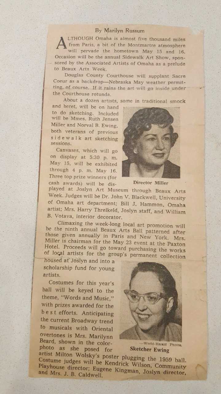
This is an article, with a picture of Ruth about an art event that she was helping to put on.


Being able to see articles like these is incredible, especially since they are so old. 


This is the notice that a local Omaha artist had won the Governor's Award for the best single painting. That artist was Ruth Jensen Miller.

This is a picture of her when she was younger, in her acting days. She often went by Ruth Maurice as well as several other names including, 
R. E. Miller
E. R. Miller
Ruth J. Miller


Although she was known by many different names in her time, she was a unique person living through many different eras like the Roaring 20's.


This is another paper clipping of her and her art club painting in her backyard. It was published, July 23, 1948.


Her work in the art community in Omaha greatly impacted how art was viewed and presented. Her presence was one of importance.


This is the other side of the newspaper clipping from above where it gives the names of blue ribbons awarded to artists.


It mentions in the middle column of Ruth's winning of two blue ribbons in the professional artists division.


The right column is listing off other winners within other divisions of the show.


Published on March 10, 1946 this paper clipping shows an article about a new art group organized by people from Omaha.

The woman in the middle is Ruth, and there are 30 members including other small groups.


Her artwork has certainly withstood the test of time, and her work is recognizable. Although she was from Omaha, she is now buried next to her daughter Marilynn in California.
 
Here are photographs of their headstones in California where they both rest. 


A few final facts about the lovely, 
Ruth Jensen Miller. 

Ruth is my great grandmother. 
Marilynn is my grandmother.
Marilynn is my father's mother.
Ruth's grandson that has that table in her still life is my father. (the last painting mentioned above)
All of the paintings are from my house, and currently reside in my basement and on the walls. 


Sources: 
My father: 
   -Pictures of the paintings and headstones
My Grandfather: 
    -Pictures of the newspaper clippings in his possession.